

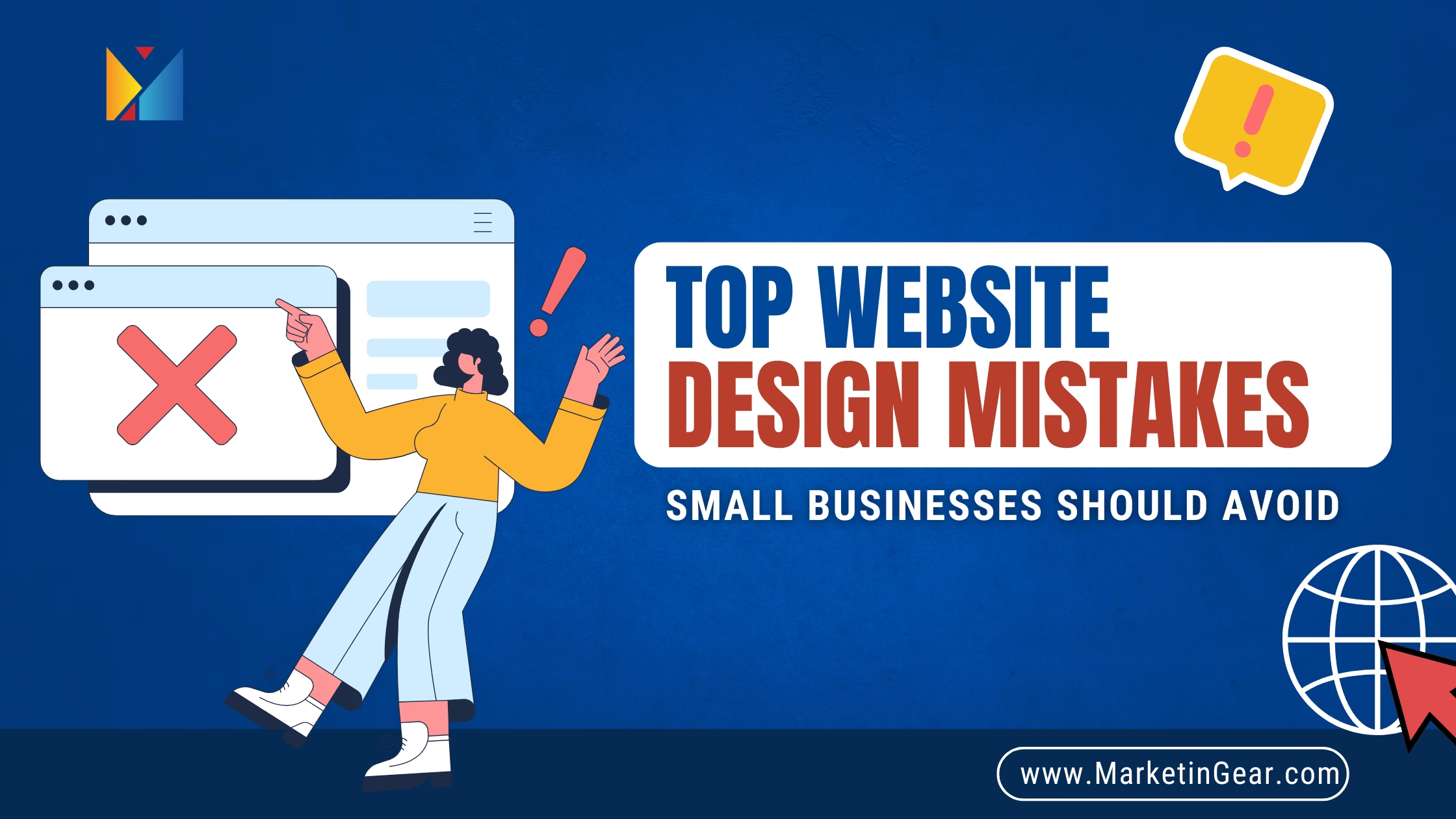
Introduction: First Impressions Matter—Don’t Blow It
Imagine walking into a store where the shelves are disorganized, the signs are confusing, and you can’t even tell where to check out. What would you do? Most people would turn around and walk right out. The same thing happens online—except users don’t even have to get up to leave. Just one click and they’re gone.
Your website is often the very first interaction someone has with your brand. It’s your digital storefront, and just like a physical shop, it needs to be clean, intuitive, and welcoming. If it’s messy, slow, or confusing, you’re not just losing traffic—you’re losing potential sales, leads, and long-term trust.
At MarketinGear, we’ve helped countless small businesses diagnose and fix website design mistakes that were quietly sabotaging their growth. Most of these blunders are surprisingly common—and totally avoidable. Let’s explore the biggest website design mistakes small businesses should avoid and how you can fix them right now.
1. Poor User Experience: If Visitors Get Lost, You’ve Already Lost
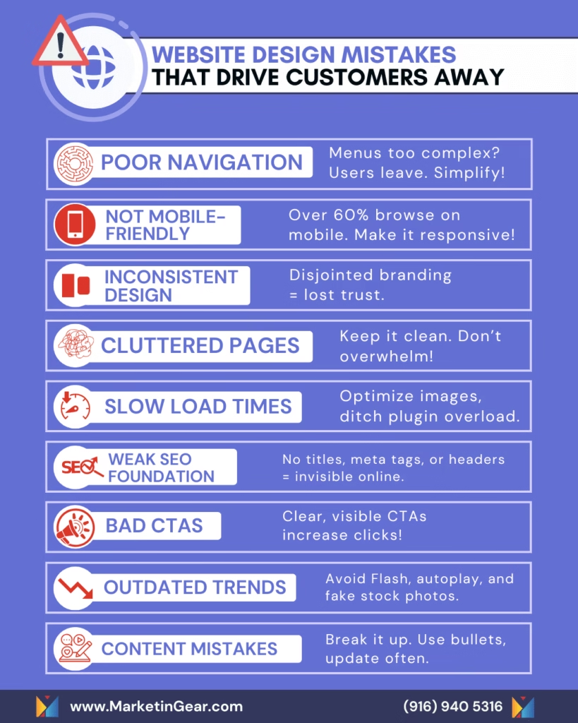
Confusing Navigation Menus
Think of your website like a map—if the directions aren’t clear, people won’t stick around to figure them out. Menus that are overly complex, loaded with multi-level dropdowns, or hidden behind hard-to-find hamburger icons (especially on desktop) are a recipe for confusion.
Fix:
Limit your top navigation bar to 5–7 key categories. Use clear, descriptive labels like “About Us,” “Services,” or “Contact” instead of vague terms. Avoid dropdowns unless absolutely necessary, and always keep the most important links easy to find—especially on mobile and desktop homepages.
Lack of Mobile Responsiveness
With over 60% of website visits coming from mobile devices, your site must look and function flawlessly on every screen size. If users have to pinch, zoom, or scroll awkwardly, they’ll leave.
Fix:
Ensure your site is built with responsive design in mind. Test it across different devices and browsers. Use flexible grids and layouts, optimize buttons for tap interaction, and always avoid content that relies on outdated tech like Flash.
Inconsistent Layout and Design
Using different fonts, mismatched colors, or erratic layouts across pages sends mixed signals to visitors. It erodes your credibility and makes your site feel unprofessional.
Fix:
Develop a brand style guide that outlines your fonts, color palette, and layout structure. Stick to 2-3 fonts max and use consistent header styles and spacing throughout your site. This not only improves aesthetics but also enhances user trust and navigation.
Cluttered or Overloaded Pages
Imagine trying to focus on a single item while a dozen pop-ups, banners, and widgets fight for your attention. That’s what a cluttered website feels like.
Fix:
Embrace whitespace. Don’t feel pressured to stuff every corner of your homepage with content. Focus on one goal per page. Declutter the header, remove unnecessary animations or elements, and keep your messaging simple and focused.
2. Slow Website Performance: Speed Can Make or Break the Sale
Unoptimized Images and Videos
High-resolution visuals might look great, but if they’re not compressed properly, they slow down your load time—and that’s a conversion killer. Users expect a page to load within 2-3 seconds. Anything longer, and they’re out.
Fix:
Use tools like TinyPNG or ImageOptim to compress images. Consider modern formats like WebP that reduce size without sacrificing quality. Also, avoid autoplay videos on background sections unless they’re absolutely essential to the message.
Excessive Plugins or Scripts
Especially for WordPress users, it’s tempting to install plugins for everything. But too many active plugins create bloat, conflicts, and slow load times.
Fix:
Conduct a plugin audit every few months. Remove unused plugins, and consolidate features when possible. Use performance monitoring tools to check which scripts are causing delays. Minify your CSS and JavaScript files, and defer non-critical scripts.
Poor Hosting Choices
You get what you pay for. Cheap or shared hosting often results in slow response times, downtime, and even poor SEO rankings due to latency issues.
Fix:
Invest in reputable hosting services that offer fast speeds, security, daily backups, and servers close to your primary audience. Look for providers with scalable options, so your hosting grows as your traffic does.
3. Weak SEO Foundation: Invisible Websites Don’t Get Clicked
Missing Meta Titles and Descriptions
Meta titles and descriptions act as your first impression on search engines. Without them—or with duplicates—you’re invisible in the eyes of Google.
Fix:
Create unique, keyword-optimized meta titles and descriptions for every page. Focus on what the user is searching for, and make your descriptions enticing enough to get clicks. Keep titles under 60 characters and descriptions under 160.
Lack of Header Tag Hierarchy
Misusing header tags doesn’t just confuse readers—it confuses search engines. Headers guide the content’s structure.
Fix:
Use only one <h1> tag per page—usually the title. Follow it with <h2> and <h3> subheadings to logically organize your content. Don’t skip levels or mix up tags for styling purposes.
No Alt Text for Images
Images without descriptive alt text hurt your site’s accessibility and miss out on SEO opportunities.
Fix:
Write concise, accurate alt text that describes the image and includes relevant keywords when natural. This also helps users with screen readers and improves image search visibility.
4. Ineffective Calls-to-Action: Don’t Let Interest Fizzle Out
Unclear CTA Buttons
A button that says “Click Here” doesn’t inspire action. People need to know exactly what they’re clicking for.
Fix:
Use specific, benefit-driven language like “Start My Free Trial,” “Download the Guide,” or “Schedule My Consultation.” Be persuasive but clear.
Poor CTA Placement
Even the best CTA won’t work if no one sees it. Burying your buttons below the fold or hiding them in the footer won’t do any favors.
Fix:
Place primary CTAs near the top of the page and repeat them at key engagement points. Use contrasting colors and whitespace to make them stand out without overwhelming the design.
Too Many CTAs on a Page
If every button screams for attention, users don’t know where to focus—and often choose nothing at all.
Fix:
Choose one primary action per page. Secondary CTAs can be included, but they should support—not compete with—the main goal.
5. Outdated Design Trends: Leave the Past Where It Belongs
Flash Animations
Flash not only lacks mobile support but also slows your site and poses security risks.
Fix:
Ditch Flash entirely. Use HTML5, CSS animations, or lightweight video formats. Prioritize functionality and speed over flashy effects.
Auto-Playing Media
Videos or music that start automatically can startle visitors and drain mobile data.
Fix:
Always mute videos by default. Let users choose when to play media, and provide captions to make content accessible.
Heavy Use of Stock Images
Generic, overused stock photos erode authenticity and make your brand forgettable.
Fix:
Use real images of your team, workspace, and products whenever possible. If you must use stock photos, select ones that feel candid and align with your brand tone.
6. Content-Related Mistakes: You’re Not Just Designing, You’re Communicating
Walls of Text
Long, dense paragraphs are hard on the eyes—especially on mobile.
Fix:
Break content into shorter paragraphs. Use headings, bullet points, and images to guide the reader’s eye. Make content easy to skim and digest.
Outdated Content
Old information makes your business appear inactive or out of touch.
Fix:
Review and update content regularly. Replace outdated stats, refresh calls to action, and archive expired promotions. Keep a content calendar to stay on top of it.
Thin Content
Pages with little to no value don’t help your users or your SEO.
Fix:
Create helpful, keyword-rich content that addresses real questions or needs. Use case studies, tutorials, or FAQs to add depth. Link to related pages to keep users exploring your site.
Conclusion: Build a Website That Works for You, Not Against You
Your website isn’t just an online placeholder—it’s your hardest-working salesperson, your digital handshake, and your brand’s first impression. By avoiding these common mistakes, you’ll not only make your site more attractive but also more effective at converting visitors into loyal customers.
💡 Want to make sure your website isn’t quietly turning people away?
Let MarketinGear give you a free website audit and custom homepage mockup—no pressure, just real insights you can use to grow.