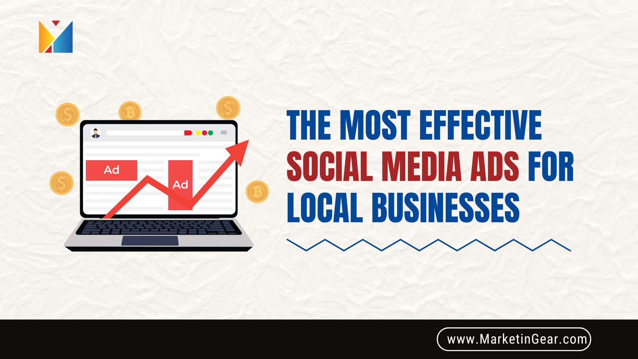

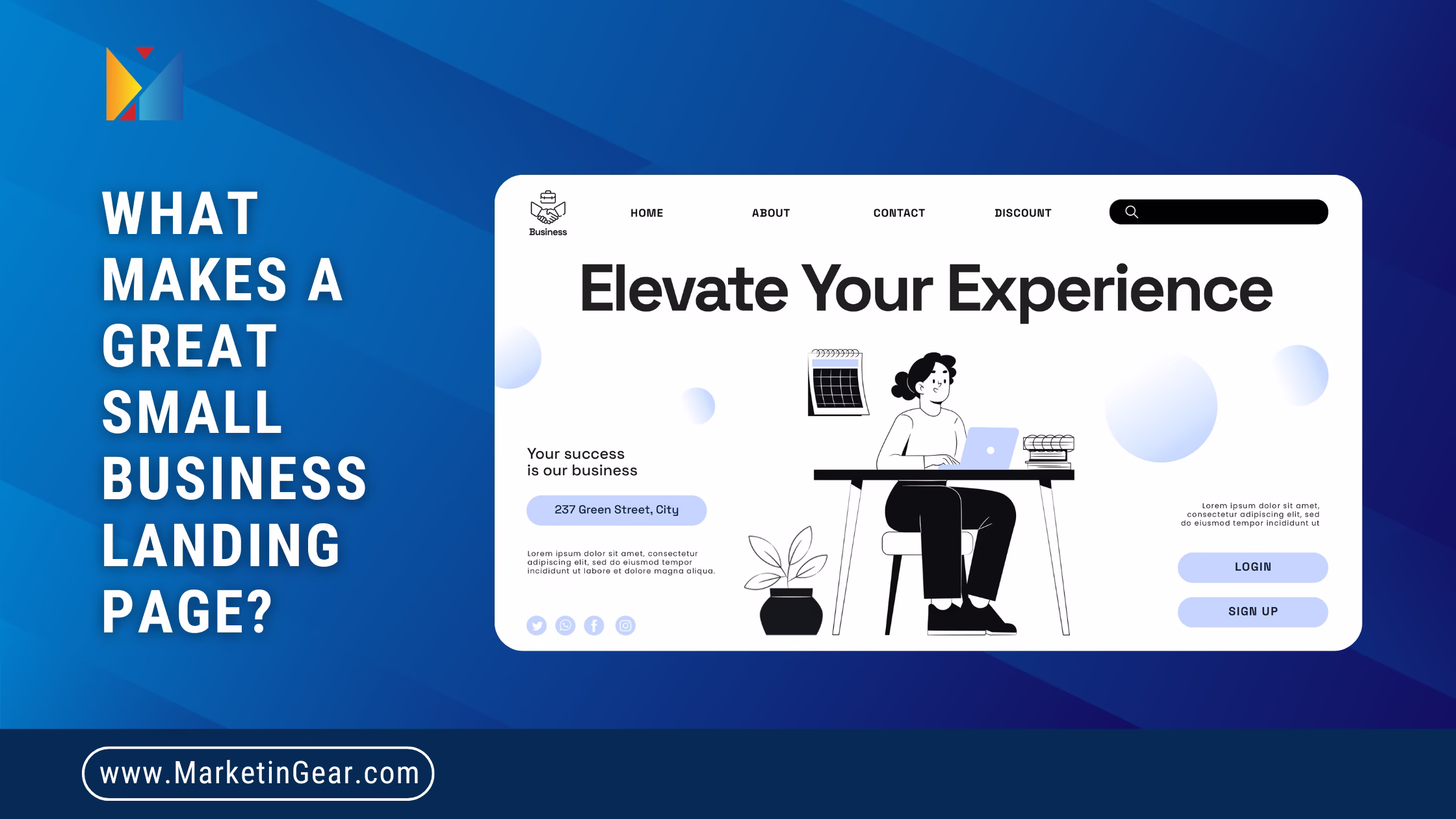
Introduction: First Impressions Matter — Make Yours Count
Imagine you’re walking into a store. The door creaks, the lighting is dim, and no one looks up to greet you. The shelves are messy. You’re not sure where to go or what to do. Chances are, you’ll turn around and leave within seconds.
The same thing happens online when someone visits a landing page that’s confusing, outdated, or overloaded with information. Your landing page is more than just a digital flyer—it’s your first impression, your handshake, and possibly your only shot at turning a curious visitor into a loyal customer.
Here’s the hard truth: people form an opinion about your landing page in under 8 seconds. That’s faster than it takes to send a text or make a cup of coffee. If they don’t immediately find something clear, helpful, or trustworthy—they’re gone. And more often than not, they’re heading straight to your competitor.
Now picture this: a visitor lands on your page. The headline speaks to them instantly. The layout is clean and inviting. The message is clear. There’s one prominent button showing them the next step. It feels smooth, effortless, and convincing. That’s the kind of landing page that doesn’t just hold attention—it drives results.
Creating this kind of page isn’t complicated. It doesn’t require a full design team or expensive software. It simply takes the right approach: put your customer first, remove distractions, and focus on clarity, value, and trust.
So, what separates a landing page that converts from one that repels? Let’s break it down step by step.
1. A Clear, Bold Headline
A landing page headline should do two things within seconds: grab attention and explain value.
Great headlines act like billboards on a busy highway—brief but impossible to ignore.
Tips for Strong Headlines:
- Keep it under 10 words.
- Focus on one major benefit or outcome.
- Use emotionally charged language that taps into your audience’s goals or frustrations.
- Be specific. Clarity beats cleverness every time.
Example:
Don’t write “Welcome to Our Site.”
Write “Double Your Sales in 30 Days with Our Proven Tools.”
2. One Goal, One Call-to-Action (CTA)
Every landing page should have one job. Whether it’s getting someone to sign up, book a demo, or download a resource—clarity of purpose is key.
Too many options lead to indecision. If your page asks users to do five things, chances are they’ll do none.
CTA Best Practices:
- Use one primary CTA per page.
- Make your CTA button visually stand out and action-oriented (e.g., “Get My Free Trial,” “Download Now”).
- Reinforce urgency and exclusivity where appropriate with phrases like “Limited Time Offer” or “Only a Few Spots Left.”
3. Build Trust with Social Proof and Testimonials
Trust is a deal-breaker. Before buying, people want to know others have done it—and loved it.
Add elements that prove your credibility and reassure visitors they’re in good hands.
Ways to Build Trust:
- Add star ratings or customer quotes.
- Show real faces (photos or videos) of past customers.
- Include trust badges like “SSL Secure,” “Verified by Google,” or “30-Day Money-Back Guarantee.”
- Mention well-known clients or media features if applicable.
Even short snippets of authentic feedback can increase conversion rates significantly.
4. Clean, Mobile-Responsive Design
First impressions aren’t just about what you say—they’re about how your site looks and feels. A cluttered, disorganized, or outdated design can make even the best offer fall flat.
And with over half of all web traffic coming from mobile devices, your page must adapt flawlessly across all screen sizes.
Design Tips:
- Use plenty of white space to avoid overwhelming visitors.
- Stick to two or three colors and fonts for a clean, consistent look.
- Avoid excessive animations or pop-ups.
- Compress images to keep loading times under three seconds.
5. Benefit-Driven Content
People don’t care about your product’s technical specs. They care about how it helps them.
Make every line of content answer the question: “What’s in it for me?”
Content Guidelines:
- Lead with benefits, not features.
- Use short paragraphs and bullet points for easy scanning.
- Highlight key takeaways using icons or visuals.
- Make it personal. Use “you” and “your” to create a direct, friendly tone.
Example:
Instead of “Advanced CRM Dashboard,” say “Track Every Customer in One Simple View.”
6. SEO-Optimized Structure
A landing page that can’t be found on Google is a missed opportunity. While your goal is conversions, it doesn’t hurt to attract organic traffic too.
Basic SEO Essentials:
- Use the main keyword in your headline (H1), meta title, and URL.
- Add descriptive alt text to all images.
- Link to relevant blog posts or service pages within your site.
- Make use of schema markup to help search engines understand your content better.
A properly SEO optimized page gets found more often and builds long-term value.
7. Visual Hierarchy and Flow
Your landing page should guide the user from start to finish, without them ever feeling lost or distracted.
Think of it like telling a story—there’s a beginning (headline), middle (benefits), and end (CTA).
Best Practices for Layout:
- Use heading tags (H1, H2, H3) to break content into digestible sections.
- Emphasize key areas using size, color, or placement (e.g., bold CTA buttons).
- Align important elements in an “F” pattern, where users naturally scan from left to right and top to bottom.
8. Short, Simple Forms
Forms are often the final hurdle—and the biggest drop-off point. Don’t make visitors work too hard to engage with you.
How to Simplify Forms:
- Only ask for essential information (usually just name and email).
- Use multi-step forms if you need more details, and show progress.
- Add helpful microcopy near fields: “We respect your privacy. No spam ever.”
Reducing friction here can dramatically improve your lead generation rate.
9. Speak Human—No Jargon
You don’t win points for sounding complex. The goal is to be understood instantly.
Use language that your audience would use in everyday conversation. If your page sounds like a technical manual, it’s time to rewrite.
Write Like This:
“We help busy business owners get more customers without hiring a full-time marketer.”
Not Like This:
“Our integrated, data-driven solutions optimize omni-channel marketing frameworks.”
The clearer you are, the more trustworthy you sound.
10. A Thank You Page with a Next Step
Once someone takes action, don’t leave them hanging. This is your chance to keep the momentum going.
After the Conversion:
- Display a thank-you message confirming what just happened.
- Offer a logical next step: download link, booking calendar, or a helpful blog post.
- Use this moment to further build the relationship.
A thank-you page isn’t just a courtesy—it’s a bridge to deeper engagement.
Conclusion: Landing Pages That Work Like Magic
Think of a great landing page as your best-performing employee. It works 24/7, never calls in sick, and always delivers the right pitch at the right time.
It doesn’t need flashy gimmicks or clever hacks—just clarity, direction, and empathy for your audience’s needs.
For small businesses with limited resources, an effective landing page can be your most powerful tool. It turns browsers into buyers. It grows your email list. It fills your calendar with leads. And it does all this quietly, behind the scenes.
Start with a headline that hooks attention. Follow with content that connects. Finish with a CTA that inspires action.
If your landing page tells the right story in the right order, users won’t just visit—they’ll stay, engage, and take the next step. And that’s how you build growth that lasts.
So ask yourself honestly: is your landing page helping you grow—or silently pushing people away?