

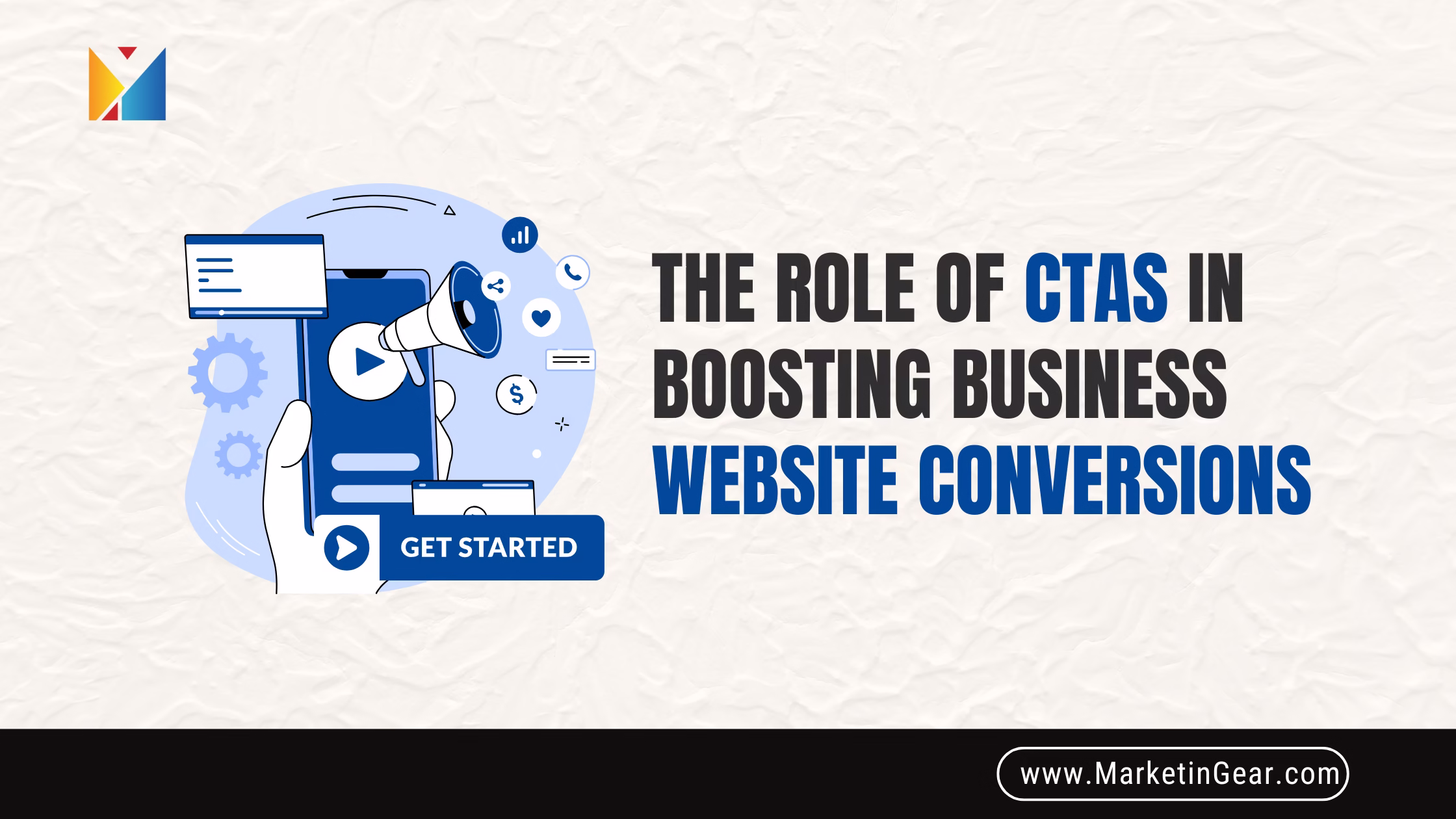
Introduction: Why CTAs Are the Secret Sauce for Small Business Success
Imagine walking into a bakery, drawn in by the smell of fresh bread, but nobody greets you, offers a sample, or points out today’s special. You might wander, maybe even leave empty-handed. That’s what visiting a website without a clear Call to Action (CTA) feels like—a missed opportunity.
For small businesses, every website visitor is precious. Turning those visitors into customers, leads, or fans depends on guiding them at every step. That’s the magic of CTAs. Whether it’s “Buy Now,” “Get a Free Quote,” or “Sign Up for Our Newsletter,” these small nudges make a huge impact on your business growth.
Let’s dive into how smart, well-placed CTAs can boost your website conversions and transform curious clicks into loyal customers.
1. CTA Best Practices: What Makes a Call to Action Effective?
A CTA isn’t just a button or a line of text—it’s your business handshake. Done right, it welcomes, convinces, and directs. Here’s what sets effective CTAs apart:
- Clear Wording: Tell visitors exactly what to do. “Download Now,” “Book a Call,” or “See Plans” leave no room for confusion.
- Visible Placement: Don’t hide your CTA in the fine print. Place it where eyes naturally go—at the top, after key info, or within sticky bars.
- Action-Oriented Language: Start with verbs that encourage movement—Discover, Start, Try, Join, Save.
- Strong Value Proposition: Why should someone click? Highlight the benefit, like “Start Free Trial—No Credit Card Needed.”
Example:
“Get Your Free Marketing Checklist” beats “Submit.”
2. Effective Call to Action Examples for Different Goals
CTAs should match your business goal. Here’s how:
- Lead Generation CTAs: “Get a Free Quote,” “Download Our Guide,” “Book a Free Consultation.”
- Sales CTAs: “Shop the Sale,” “Add to Cart,” “Buy Now and Save.”
- Newsletter Signup CTAs: “Join Our Email List,” “Get Weekly Tips,” “Subscribe for Updates.”
- Download CTAs: “Download Brochure,” “Access the eBook,” “Get the App.”
- Social Sharing CTAs: “Share This Post,” “Tweet Your Thoughts,” “Pin for Later.”
- Event Registration CTAs: “Reserve Your Seat,” “Register Now,” “Save My Spot.”
Each CTA is designed to move the user one step closer to becoming a customer or loyal follower.
3. The Science of CTA Button Design
How your CTA looks matters as much as what it says. Here’s how to design a button that gets clicks:
- Color Psychology: Colors evoke emotion. Red and orange feel urgent, blue is trustworthy, green means go. Use a color that stands out from your site but fits your brand.
- Size and Shape: Bigger isn’t always better, but your CTA should be easy to spot and tap—especially on mobile. Rounded corners often feel friendlier.
- Whitespace: Don’t crowd your CTA. Give it breathing room to draw attention.
Real-World Tip:
Brands like Netflix use bold, contrasting colors (“Join Free for a Month”) to draw the eye.
4. CTA Placement Strategies That Drive Results
Where your CTA lives on your page can make or break conversions:
- Above the Fold: Place a strong CTA where visitors don’t need to scroll.
- After Key Information: Add CTAs after explaining benefits or sharing testimonials.
- Sticky CTAs: Keep a CTA button fixed as visitors scroll, so it’s always handy.
- Pop-Ups and Slide-Ins: Use sparingly—well-timed pop-ups (after 30 seconds or when exiting) can grab attention without being annoying.
Pro Tip: For service businesses, use a CTA at the top (“Book Now”), after the service list, and in the footer.
5. Crafting CTA Wording: Speak Directly to Your Audience
Words have power. Great CTA copy uses:
- Simple Language: Skip the jargon. “See How It Works” feels inviting; “Commence Your Digital Transformation Journey” sounds cold.
- Urgency and Scarcity: “Limited Time Offer,” “Book Your Spot,” or “Only 5 Left” creates FOMO.
- Personalization: If possible, use dynamic CTAs—“Start Your Free Trial,” “Get Tips for Your Business.”
6. Optimizing CTAs for Conversion
Making a CTA is just the start. Here’s how to get the most from every click:
- A/B Testing: Try different colors, wording, and placements. Even small tweaks can lift clicks by 20% or more.
- Personalized CTAs: Show different offers based on user location, device, or previous actions.
- Mobile-Friendly Design: CTAs should be big enough to tap and easy to read on small screens.
- Performance Metrics: Track clicks, conversions, and scroll depth to see what’s working.
7. Types of CTAs for Different Business Models
E-commerce:
- “Add to Cart”
- “Get 10% Off Today”
Service Businesses:
- “Schedule a Free Consultation”
- “Request a Callback”
SaaS:
- “Start Free Trial”
- “Watch Demo”
Local Businesses:
- “Find Us Near You”
- “Book Your Visit”
Each business type has CTAs that fit its audience and goals.
8. CTAs and User Experience: Seamless, Not Pushy
A great CTA fits naturally into your website’s journey.
- Website Navigation: “Contact Us” or “Get Started” buttons in the top menu.
- Pop-Up CTAs: Use for time-limited offers or exit intent, not as a constant distraction.
- Sticky CTAs: Useful for mobile, so users never lose sight of your offer.
9. Common CTA Mistakes to Avoid
Don’t let your CTAs sabotage conversions:
- Overused CTAs: “Click Here” without context doesn’t inspire action.
- Misleading CTAs: Never promise what you can’t deliver.
- Cluttered CTAs: Too many options = decision paralysis.
- Unclear Value: Users should know exactly what they’ll get.
10. Advanced CTA Strategies for High Conversions
- Dynamic CTAs: Show different CTAs based on user behavior or stage in the funnel.
- Multi-Step CTAs: “Start Quiz”—then collect an email at the end.
- Urgency and Scarcity: “Only 24 Hours Left,” “Limited Spots Available.”
- FOMO: “Join 10,000+ Happy Customers.”
11. Measuring CTA Success: Don’t Guess, Track!
Data is your friend:
- CTA Analytics: Use tools like Google Analytics or Hotjar to track CTA performance.
- Tracking Clicks: See which CTAs get the most action.
- Improving ROI: Double down on what works, change what doesn’t.
Conclusion: Make Every Click Count
Every website visit is a chance to grow your business. Well-crafted CTAs are more than just buttons—they’re invitations, guides, and the key to turning curiosity into conversion. By following these tips and putting your customer first, you’ll make your website a place where visitors don’t just browse—they act.
Ready to boost your business website conversions?
At MarketinGear, we help small businesses design, test, and perfect CTAs that get results. Book your FREE website audit today and see how powerful a simple button can be.


