

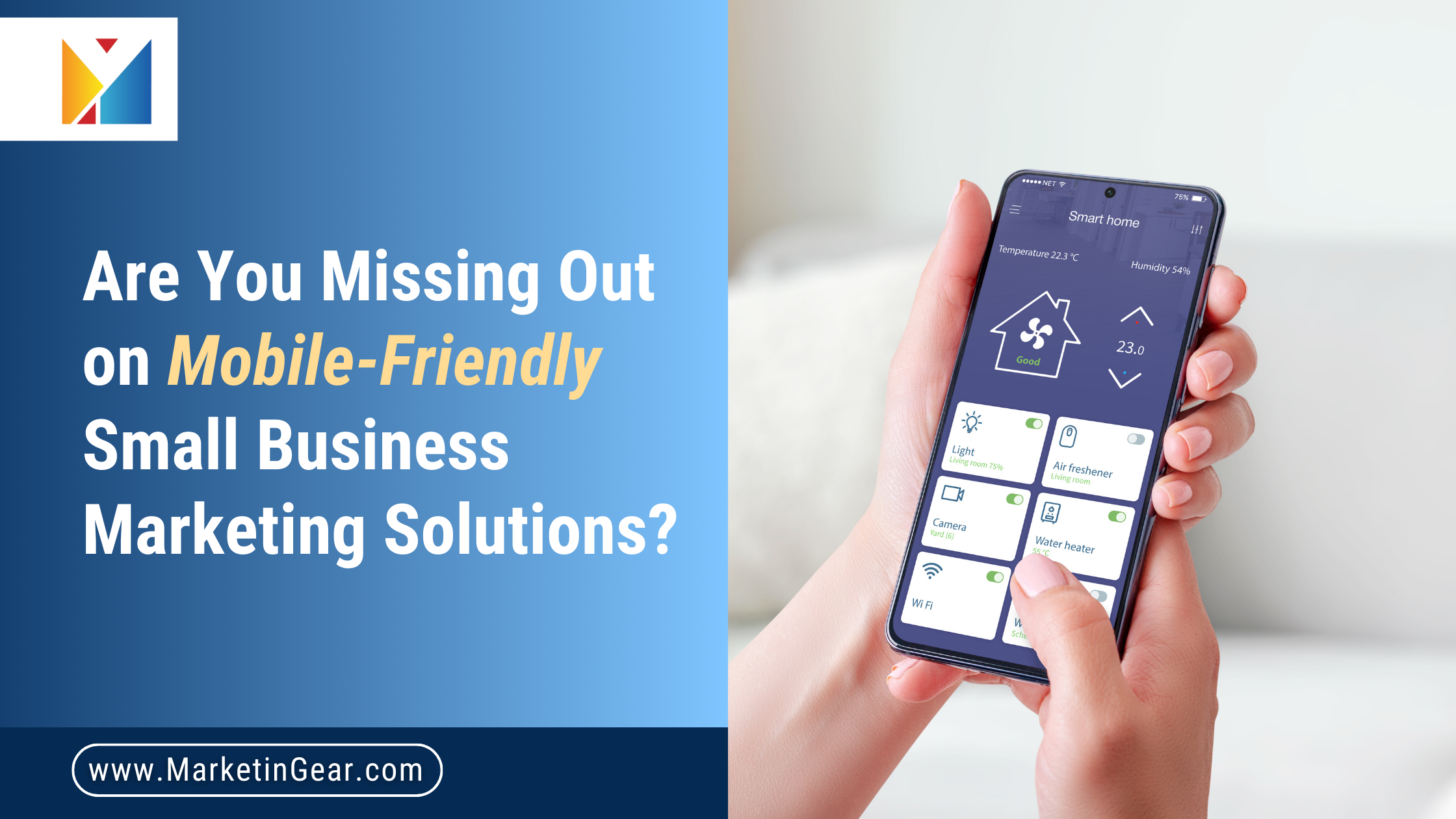
Introduction
Let’s face it: the way people interact with businesses has changed. Gone are the days of browsing through large desktop screens to find the right product or service. Today, most people pull out their phones to research, shop, and connect with businesses on the go. If your business website isn’t mobile-friendly, you’re missing out on a massive chunk of potential customers.
In fact, mobile optimization is no longer just a “nice-to-have” feature; it’s essential for your small business’s survival and growth. As small business owners, you might already have a website, but the question is: Is it truly optimized for mobile devices? If not, you could be leaving money on the table.
This blog will explore why mobile marketing solutions are crucial for small businesses, the benefits of mobile optimization, and how you can implement these strategies to stay competitive and attract more customers.
Why Mobile Optimization Is Crucial for Small Businesses
1. Mobile Usage is Through the Roof
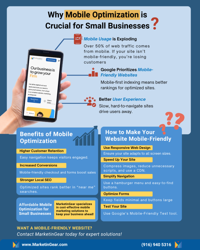
It’s no surprise that mobile phones are the most commonly used device for internet access. According to statistics, over 50% of web traffic comes from mobile devices. This trend is only going to continue as more people use their smartphones and tablets for browsing, shopping, and business research. Businesses that fail to adapt to this shift risk losing a significant portion of their audience. Ensuring a seamless mobile experience is no longer optional—it’s a necessity for sustained growth and success.
For small businesses, this means your website must be mobile-friendly—or risk being overlooked by your potential customers who are trying to access your site from their phones. A poor mobile experience could drive them straight to a competitor with a more seamless website.
2. Google Loves Mobile-Friendly Websites
Did you know that Google prioritizes mobile-friendly websites in search results? This is thanks to mobile-first indexing, which means Google looks at the mobile version of your website first before the desktop version. If your website isn’t optimized for mobile, it may not rank as highly as your competitors, causing you to lose valuable visibility in search results. Additionally, mobile-friendly websites tend to have lower bounce rates, as users are more likely to stay and explore when the experience is seamless. By focusing on mobile optimization, small businesses can enhance their search performance and build a stronger online presence.
The good news is, by implementing mobile optimization strategies, you can improve your chances of ranking higher in local search and attract more organic traffic to your site. This means more visibility for your business and increased opportunities to connect with potential customers. A well-optimized mobile site can make the difference between gaining a new client or losing them to a competitor.
3. Mobile-Friendly Websites Improve User Experience
A website that isn’t optimized for mobile can be frustrating for users. Slow loading times, difficult navigation, and buttons that are hard to click can drive people away faster than a car speeding down the highway. On the flip side, a mobile-optimized website provides a seamless, user-friendly experience that keeps potential customers engaged and increases the likelihood of conversions. It allows visitors to easily access information, complete actions, and interact with your brand without unnecessary friction. Additionally, a well-optimized mobile experience can lead to higher customer satisfaction and long-term loyalty.
The Benefits of Mobile Optimization for Small Businesses
1. Improved Customer Retention and Engagement
When your site is easy to navigate on a mobile device, customers are more likely to stay engaged with your business. A mobile-friendly business website ensures customers can easily find what they need, from products to services to contact information. It also creates a positive first impression, showing that your business is modern and customer-focused. Furthermore, a well-optimized site enhances accessibility for all users, including those with disabilities. A seamless experience on mobile helps build trust and credibility, encouraging repeat visits and long-term customer relationships.
Additionally, a seamless mobile experience encourages users to spend more time exploring your offerings, increasing the chances of conversion. Happy customers are more likely to return and may even refer your business to others. Plus, satisfied customers are more inclined to leave positive reviews, boosting your online reputation.
2. Increased Conversion Rates
A mobile-optimized website makes it easier for customers to complete transactions or take action, whether it’s booking an appointment, signing up for a newsletter, or making a purchase. By streamlining the mobile experience, you reduce friction and increase the likelihood that visitors will convert into loyal customers. A smooth, intuitive experience builds trust and encourages repeat business. Plus, mobile-friendly checkout processes can significantly decrease cart abandonment rates, boosting your overall sales.
For example, a customer on a mobile phone may want to schedule an appointment with your service but could abandon the task if your booking form isn’t optimized for mobile. However, with mobile-friendly business website tips, such as simple, easy-to-fill-out forms and streamlined navigation, customers are more likely to complete the action.
3. Better Local Search Performance
For small businesses, local SEO is incredibly important. Many customers search for businesses “near me,” whether they’re looking for a plumber, restaurant, or auto repair shop. If your site isn’t optimized for mobile, it could hurt your visibility in local search results, meaning fewer potential customers will find you.
A mobile-optimized website ensures you don’t miss out on these valuable leads. Additionally, it can improve your local SEO ranking, making it easier for customers in your area to find your services.
How to Make Your Small Business Website Mobile-Friendly
1. Responsive Web Design
The foundation of any good mobile marketing solution is responsive web design. This means your website automatically adjusts to fit any screen size—whether it’s a desktop, tablet, or mobile phone. With a responsive design, customers will have an optimal viewing experience, making it easier to navigate your site and complete actions. Additionally, a well-designed responsive website helps maintain a consistent brand image across all devices, reinforcing credibility and professionalism.
2. Speed is Everything
Did you know that 53% of mobile users will leave a website if it takes longer than 3 seconds to load? In the fast-paced mobile world, speed is critical. Optimizing your website’s speed for mobile devices can be the difference between a customer staying or leaving your site in frustration. A faster website not only improves user satisfaction but also enhances search engine rankings. Additionally, it reduces bounce rates and increases the chances of conversions, directly impacting your bottom line.
You can speed up your mobile website by:
- Reducing image sizes without compromising quality
- Minimizing JavaScript and CSS files
- Using a content delivery network (CDN) to speed up load times
3. Simplify Navigation and Layout
Mobile screens are smaller, which means you don’t have the luxury of long, complex menus. Keep things simple and intuitive by ensuring that key pages (like services, about us, and contact) are easy to find. Consider using a hamburger menu or sticky navigation so that users can quickly access the most important areas of your site. Additionally, make sure buttons and links are large enough to tap easily, reducing frustration and improving accessibility for all users.
4. Optimize Forms for Mobile
Forms are a critical part of many websites, whether for collecting customer inquiries or taking bookings. If your forms aren’t optimized for mobile, users may struggle to complete them on their phones, causing frustration and lost opportunities. Poorly designed forms can lead to abandoned interactions and decreased conversions. A streamlined, mobile-friendly form ensures a seamless user experience, encouraging more completions and improving customer satisfaction.
To make your forms mobile-friendly:
- Use larger buttons and input fields to enhance usability and prevent accidental clicks. Ensure there is ample spacing between elements for a smooth touch experience.
- Minimize the number of fields to make the form faster to complete
- Include dropdowns or date pickers for easy input
5. Test Your Website
Even if your website looks great on desktop, it’s important to test how it performs on mobile. Tools like Google’s Mobile-Friendly Test can help you assess how your website performs on various devices and identify areas for improvement. Regular testing ensures your site remains compatible with new mobile technologies and updates. Additionally, gathering user feedback can provide insights into potential pain points that may not be immediately obvious. Consider running A/B tests to compare different layouts and functionalities to determine what works best for your audience. Continuous optimization based on real user data can help enhance the overall mobile experience and boost engagement.
Affordable Mobile Optimization Services for Small Businesses
As a small business owner, it’s easy to think that mobile optimization is out of your budget. However, there are plenty of affordable mobile optimization services that can help you achieve a professional, mobile-friendly website without breaking the bank. Investing in mobile optimization is not just a cost; it’s a long-term strategy that enhances customer engagement and boosts revenue. A well-optimized site ensures you remain competitive in an increasingly mobile-first world.
At MarketinGear, we specialize in providing mobile marketing solutions for small businesses. We can help you optimize your website, improve user experience, and implement strategies that will increase your visibility and drive more traffic. Our team is dedicated to ensuring your website meets the latest mobile standards and provides an exceptional user experience. Whether you’re just getting started or looking to revamp your existing website, we’ve got affordable solutions tailored to your needs. Let us help you turn mobile visitors into loyal customers with a seamless and high-performing website.
Conclusion: Don’t Let a Non-Mobile-Friendly Website Hold Your Business Back
If you want to stay competitive in today’s digital world, you can’t afford to ignore mobile optimization. With mobile marketing solutions and a mobile-friendly business website, you can ensure that your business stays visible, accessible, and ready to convert on-the-go customers.
At MarketinGear, we’re experts in helping small businesses thrive online. Let us help you create a mobile-optimized website that works for your business and keeps your customers coming back for more. Contact us today to learn more about our affordable mobile optimization services!


